Search Mr. Robertson's Corner blog

Search Wikipedia

Search results

Showing posts with label Graphic organizers. Show all posts

Saturday, March 1, 2025

How to use tables, graphs, and charts

Study guide: Tables, bar charts, line graphs, pie charts, and stem-and-leaf plots

Introduction

Welcome to your study guide on different kinds of graphs and charts! In this guide, you will learn about tables, bar charts, line graphs, pie charts, and stem-and-leaf plots. These tools help us organize information (data) so we can understand it better, compare things, and explain our ideas clearly. Whether you're checking out a sports statistic, reading a weather report, or even looking at your school grades, graphs and charts are there to help you make sense of the numbers.

Why should we learn about graphs and charts?

Organization: They help arrange lots of numbers and facts in a neat and clear way.

Analysis: Graphs let us see patterns, trends, and differences quickly. For example, you can see if something is increasing, decreasing, or staying the same

Explanation: They make it easier to share and explain information to others. A picture (or graph) often tells the story better than a long list of numbers!

Imagine a chef checking which dish is most popular or a coach looking at players' scores. In each job, clear graphs and charts help professionals make better decisions.

1. Tables

What they are: Tables use rows and columns to organize data. Think of a table like a grid where each cell holds a piece of information.

Why they’re useful: Tables let you look up specific numbers quickly. They are great for listing information like class test scores, a schedule of events, or even a menu.

Real-world example: In a school, a teacher might use a table to show students' names alongside their test scores. In a grocery store, a price list in a table helps you find how much each product costs.

2. Bar charts

What they are: Bar charts use bars (either vertical or horizontal) to show how different groups compare to each other.

Why they’re useful: They make it easy to compare the size or amount of different groups at a glance.

Real-world example: A sports team might use a bar chart to compare the number of goals scored by each player. In business, a bar chart can show sales numbers for different products.

3. Line graphs

What they are: Line graphs use points connected by lines to show changes over time.

Why they’re useful: They are perfect for showing trends, like rising or falling temperatures, over days, months, or even years.

Real-world example: Weather stations use line graphs to show changes in temperature during the week. Scientists use line graphs to track changes in plant growth over time.

4. Pie charts

What they are: Pie charts are circular graphs divided into slices. Each slice shows a part of the whole.

Why they’re useful: They help you see how a total amount is split into different parts, making it easy to see proportions.

Real-world example: In a classroom, a pie chart might show the percentage of students who prefer different types of snacks. Businesses use pie charts to see what percentage of their sales comes from each product.

5. Stem-and-leaf plots

What they are: A stem-and-leaf plot is a way to display data where numbers are split into a “stem” (the first digit or digits) and a “leaf” (the last digit).

Why they’re useful: This plot shows how data is distributed and helps you see the shape of the data (for example, whether most numbers are grouped together or spread out).

Real-world example: A teacher might use a stem-and-leaf plot to display the distribution of scores on a test. This makes it easier to see if many students scored similarly or if there was a wide range of scores.

How graphs and charts help in different jobs and careers
  • Business: Managers use bar charts and pie charts to track sales, compare products, and plan for the future.
  • Science: Researchers use line graphs to study trends like temperature changes or population growth.
  • Healthcare: Doctors and nurses use line graphs to monitor patients’ vital signs, like heart rate or blood pressure, over time.
  • Sports: Coaches use bar charts and line graphs to analyze players’ performance and strategize for upcoming games.
  • Education: Teachers use tables and stem-and-leaf plots to record and review student progress and test scores.
Conclusion

Graphs and charts are more than just pictures - they are powerful tools that help us make sense of the world around us. By learning how to create and interpret tables, bar charts, line graphs, pie charts, and stem-and-leaf plots, you gain skills that are useful in school and many jobs. They help you organize data, spot trends, compare information, and explain your findings clearly.

So, next time you see a graph or chart, remember: you’re looking at a clever way to understand and share important information. Happy graphing!

Tuesday, August 15, 2023

Understanding text-dependent analysis

A beginner's guide to text-dependent analysis for middle school students and high school students

What is Text-Dependent Analysis (TDA)? What are some effective strategies and practice ideas to help middle school students and high school students adequately prepare for TDA as part of a major assignment, test, or exam?

Introduction

As students progress through their academic journey, they encounter a variety of assignments, tests, and exams that challenge their critical thinking and analytical skills. Among these types of assessments is a writing task known as Text-Dependent Analysis (TDA). TDA is an activity that requires students to read a complex text and analyze it by citing textual evidence to support their responses. The purpose of this blog post is to provide a beginner's guide to TDA targeted at middle and high school students. We will discuss what TDA is, why it is important, and offer several effective strategies and practice ideas to help students excel in this task.

Preparing for TDA

1. Understand the structure of TDA: Before students can begin to practice Text-Dependent Analysis, it is essential to understand the structure of the task. This activity typically consists of three parts – introduction, body, and conclusion. The introduction, as the word suggests, introduces the topic or prompt and sets the context for the TDA. The body of the TDA includes evidence and reasoning, which supports the student's understanding of the text. Finally, the conclusion sums up the student's response to the prompt.

2. Annotate the text: An essential strategy for TDA is to thoroughly annotate the text. Annotating the text involves highlighting key phrases and noting any questions, comments, or observations. By doing this, students can develop a deeper understanding of the text and support their analysis with specific textual evidence.

3. Use graphic organizers: One effective way to prepare for TDA is to use graphic organizers. Graphic organizers are visual tools that students can use to organize their thoughts and ideas. They provide a structured framework that can help students identify key points in the text, analyze and interpret those points, and connect them to the prompt.

4. Practice responding to prompts: The best way to get better at TDA is to practice responding to prompts. It is important to keep in mind that the prompt's focus is not only on content, but also on structure, grammar, and mechanics. Therefore, when practicing responding to prompts, pay attention to the structure, organization, and use of evidence, and ensure that the writing is clear and concise.

5. Seek feedback: Another crucial aspect of preparing for TDA is seeking feedback from teachers or tutors. It is vital to ask them to review your writing and provide constructive feedback on areas that need improvement. Take their suggestions and apply them to the next TDA writing task to improve your performance.

Conclusion

In conclusion, Text-Dependent Analysis is an essential writing task that helps students develop their analytical and critical thinking skills. By understanding the structure of TDA, thoroughly annotating the text, using graphic organizers, practicing responding to prompts, and seeking feedback from teachers, students can master this task. Overall, the key to excelling in TDA is to have a deep understanding of the text, organize thoughts and ideas effectively, and use textual evidence to support your response. We hope that the strategies and practice ideas discussed in this blog post will help students improve their performance in Text-Dependent Analysis.

Wednesday, April 26, 2023

Graphic organizer charts for students

Organize your notes with these graphic organizer charts

What are examples of graphic organizer charts that students can use to keep track of their research notes and ideas?

Introduction

Research is a crucial part of any academic work. Whether you're doing a project or preparing for an upcoming exam, gathering information is your top priority. However, it can be challenging to keep all the facts, ideas, and data organized. Luckily, there's a solution! Graphic organizer charts. These helpful tools can help you keep track of your research notes, ideas, and findings. In this post, we'll explore some of the best examples of graphic organizer charts that students can use to organize their research notes and ideas.

Different graphic organizer examples to try out

1. Venn Diagrams

One of the most popular graphic organizer charts is the Venn diagram. It consists of two or more overlapping circles that represent the similarities and differences between two or more sets of data. As a student, you can use Venn diagrams to compare and contrast information, such as different theories, characters, events, or concepts. For instance, you can use a Venn diagram to compare and contrast two historical figures or two literary works. You can also use a Venn diagram to explore the intersections between two disciplines, such as science and literature.


Venn diagram example
Venn diagram. The overlapping space is used to list similarities between the two concepts/people/events/subjects being explored. 


2. Mind Maps

Another powerful tool for organizing your research notes is the mind map. This type of graphic organizer chart lets you create a visual web of interconnected ideas, concepts, and keywords. You start with a central idea or theme and then add branches that lead to related topics or categories. You can use colors, symbols, and images to make your mind map more engaging and memorable. Mind maps are perfect for brainstorming, outlining, and summarizing complex information, such as theories, arguments, or historical events.


Mind map example
A typical mind map template.


3. Flowcharts

If you need to represent a series of steps or processes, a flowchart might be your best choice. Flowcharts are visual diagrams that show the sequence of events or actions from beginning to end. They consist of various shapes, such as circles, rectangles, diamonds, and arrows, that indicate the different stages or decisions of a process. Flowcharts can help you track the progress of your research, identify potential roadblocks, and analyze the logic of a system or a concept.


Flowchart example
Flowchart example


4. T-Charts

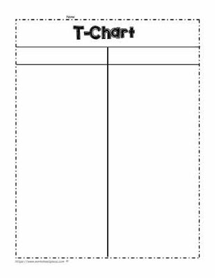
A T-Chart is a simple but effective tool for comparing and contrasting two different categories of information. It consists of a vertical column on the left and right side of a horizontal line. You can use it to categorize data based on different criteria, such as pros and cons, advantages and disadvantages, or causes and effects. For instance, you can use a T-Chart to compare two political candidates or two mathematical formulas.
T-chart example
The T-chart is a classic graphic organizer, and just like the Venn diagram, quick and easy to set up.


5. Concept Maps

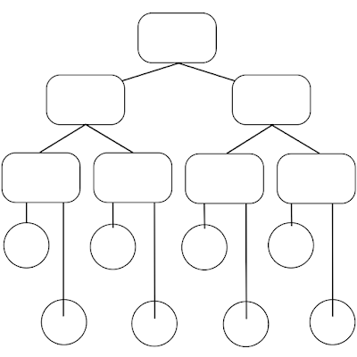
Concept maps are another type of graphic organizer chart that can help you visualize complex ideas, relationships, and processes. Unlike mind maps, which emphasize the central theme, concept maps allow you to explore multiple connections between different concepts or categories. They consist of nodes or bubbles that represent key concepts or categories, and lines that link them together according to their relationships. You can use concept maps to analyze the structure of a text or a system, to generate new ideas, or to revise and summarize your research notes.


Concept map example
Concept map model


Conclusion

In conclusion, graphic organizer charts are powerful tools for keeping track of your research notes and ideas. By using visual aids, you can organize and understand complex information more effectively, and enhance your critical thinking and creative skills. Whether you prefer Venn diagrams, mind maps, flowcharts, T-charts, or concept maps, there's a perfect tool for your needs. So, next time you conduct research, don't forget to use a graphic organizer chart and see the difference!